branding and logo, identity design for kastel
kastel: inspired by california – shaped by scandinavia is the motto that two sneaker enthusiasts, and founders of kastel, use to explain their uniquely blended designs. the designers relaunched one of their favorite california-based sneaker brands from the 90’s, but this time built for a new purpose. the new kastel shoes are constructed with the functionality and advanced fabrics suited for both the nordic climates, and hot, sunny california where the brand was born. with a fresh revamped look, kastel was rebranded and reborn.
original kastel logo:
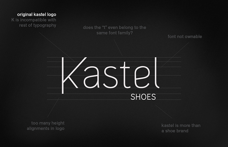
ceft and company was given the task of redesigning the kastel identity for their brand relaunch. the original logo was suitable, however it had certain issues that needed to be addressed. evolution, not revolution, was the answer in this specific scenario…
![]()
![]()
ceft and company’s new logo for kastel
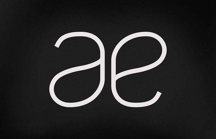
after several iterations, a cleaner, streamlined logo was chosen, which retained elements of the original logo while addressing the problems. the angle of the letter “k” was retained in order to correspond to the stitching on the shoes. the general style of the typeface was kept, however custom letters were designed within that style and repeated to create synergy (a and e). the word “shoes” was removed as kastel’s founders had visions to expand the brands offerings into broader accessories.
![]()
final logo design by ceft and company for kastel.
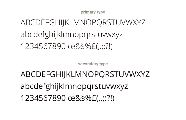
primary and secondary brand fonts.
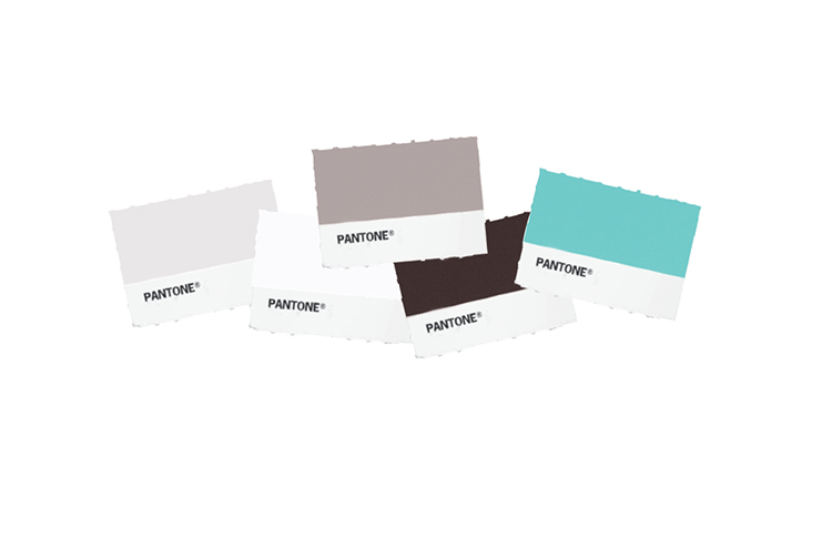
the brand colors: inspired by the elements such as gray skies, snow, sand, bark, and complimented with a punch of “nordic ice” blue.
![]()
logo and its various color applications… here, in nordic ice.

![]()
kastel logo in snow.
![]()
kastel logo in bark.
![]()
![]()
kastel logo in sand/earth.
![]()

brand application to kastel packaging
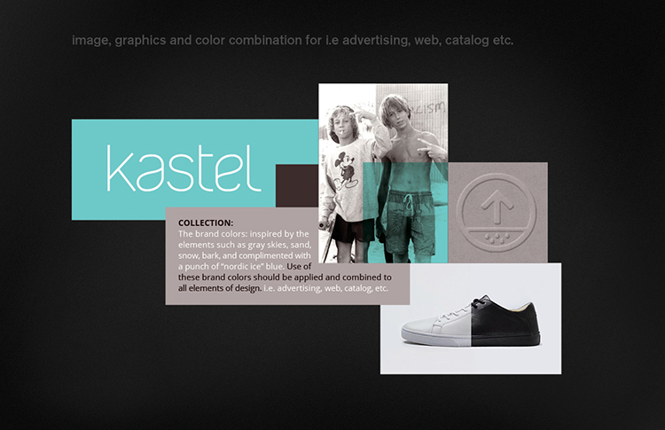
reference layout: how the colors could work together with imagery and text.
![]()
kastel logo in grey skies.
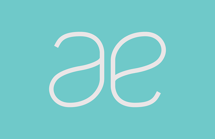
kastel a and e
![]()
t
hrough customized letters the logo is “ownable” and special. the letters a, e, t, and l were altered, and repeated, to create mnemonic rhythm.
![]()
![]()
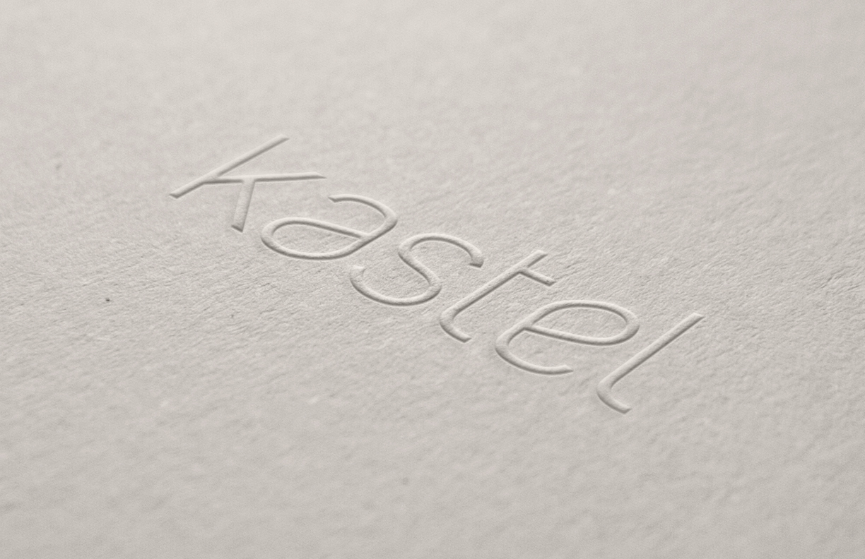
tone-on-tone application: kastel logo embossed on card stock.
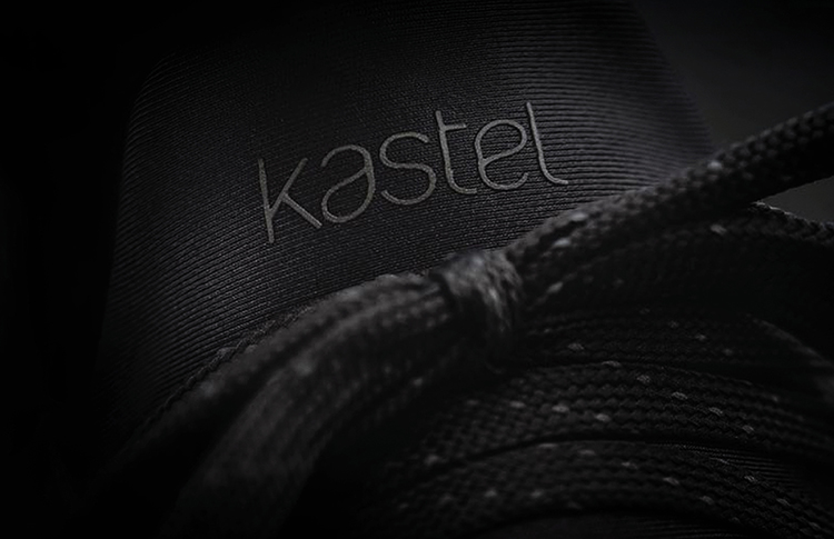
on product: the new kastel logo applied to the upcoming shoe collection.
![]()
tone-on-tone application: kastel matte/gloss logo debossed on black stock.

K+CCo1 streamlined low profile sneaker available in sand or white.
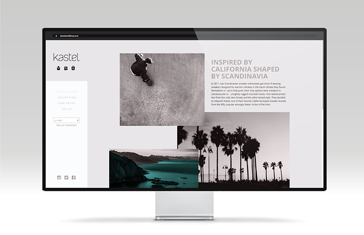
the newly designed kastel website: at home on the rocks, or on the sand “…inspired by california – shaped by scandinavia.”
after the completion of the identity development, ceft and company engaged with kastel on the redesign of their e-commerce website. the end result was a collaboration between our client, andreas malo dyb, with his creative wisdom, ceft and company producing design, and our sister agency “new york digital labs” with their seamless implementation and coding. view all work for kastel.