logo and identity design for essmay new york
essmay new york is a fashion brand rooted
in the love for travel
and a passion for details
every piece created is designed for the curious, the adventurous, the creators who collect memories.
application of primary color codes
the agency began with an extensive naming exercise that generated more than 100 potential names. “essmay,” spelled phonetically, was ultimately selected and successfully cleared through the legal process.
from the outset, a feminine name was of particular interest, although the exploration extended across a wide range of creative directions. once the essmay URL was secured, the logo development began.
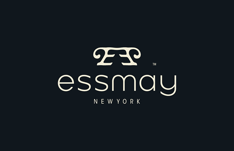
the final identity features a custom-designed, sans-serif-inspired typeface presented entirely in lowercase. this approach captured the essence of an inclusive, feminine brand—one that feels contemporary, confident, and worldly.
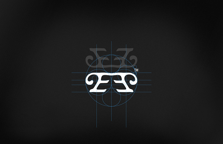
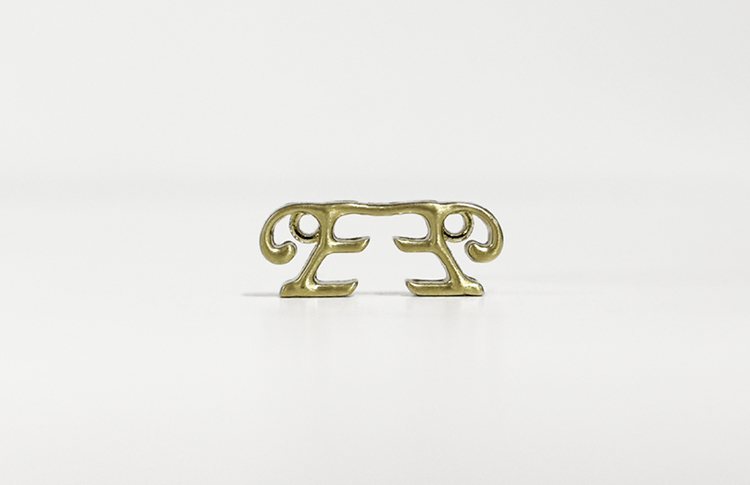
a range of logo mark options was presented, including the double-facing initial “E” shown above. its feminine curves and distinctive art deco flourishes were inspired by the intricate patterns and embroidery featured in the initial collection shared with the agency at the inception of the project.
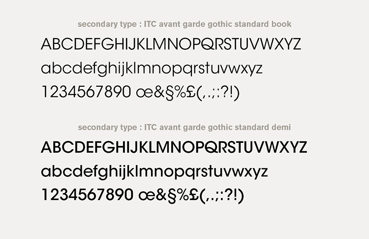
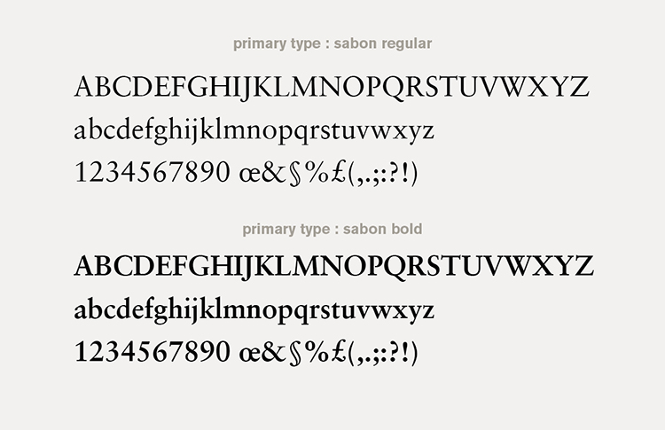
primary and secondary brand fonts
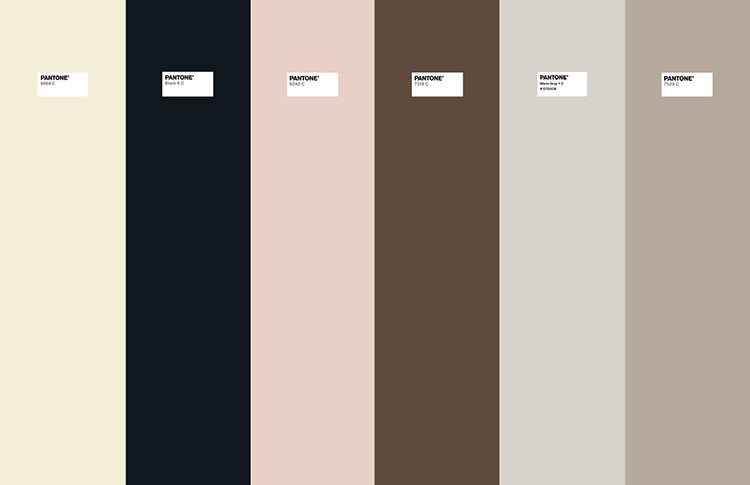
essmay brand colors
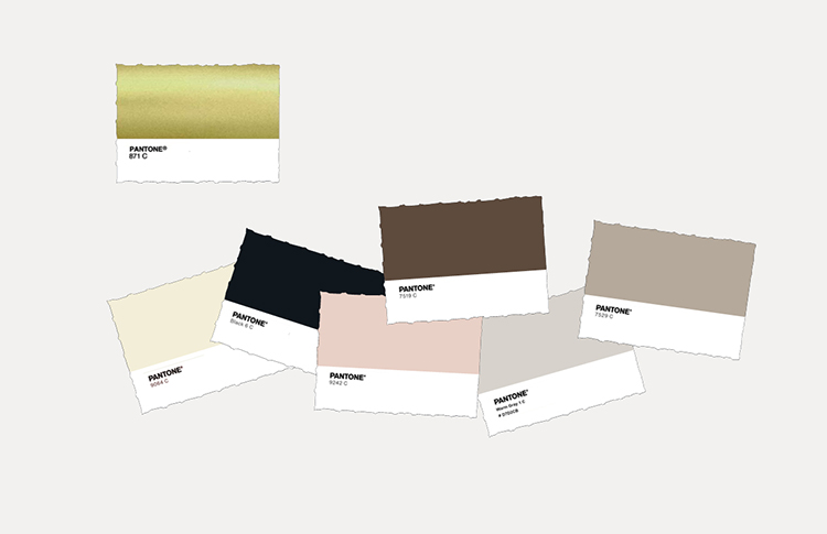
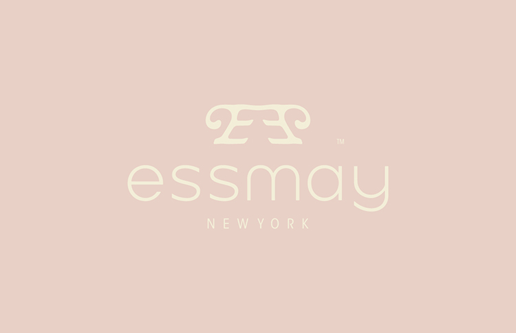
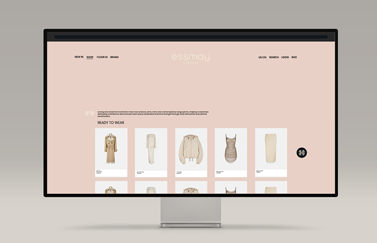
color application to logo above and website below
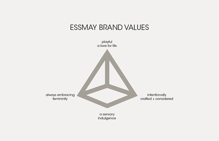
positioning and brand statement where created for the brand intended for internal and PR purposes.
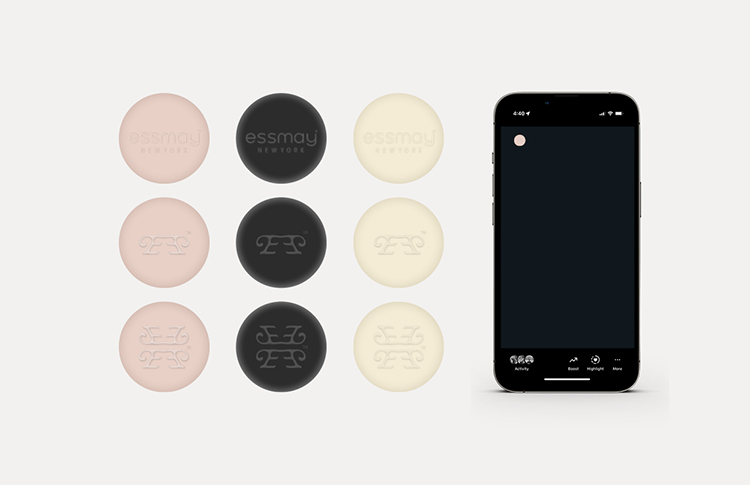
social icons
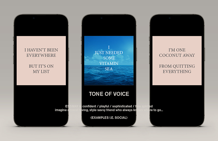
inspired by the energy of new york city, the textures of faraway lands, and the stories of our travels and close friends.
the collections celebrate individuality, inclusiveness, and the joy of discovery.
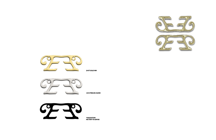
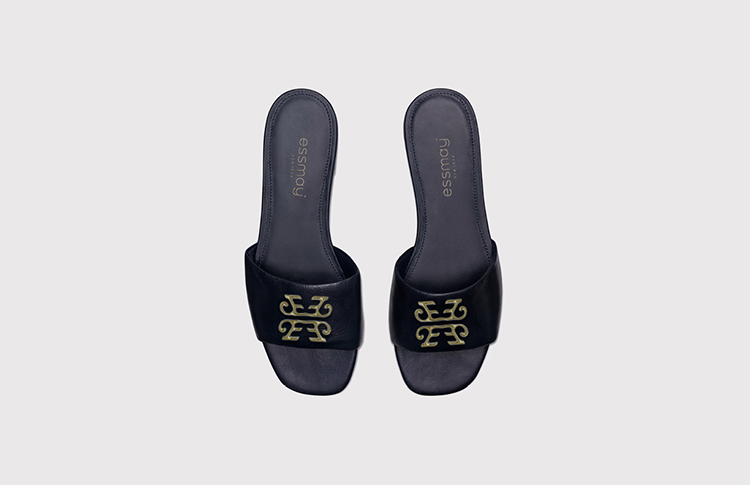
brass icon logo hardware
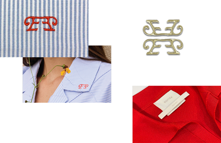
label application

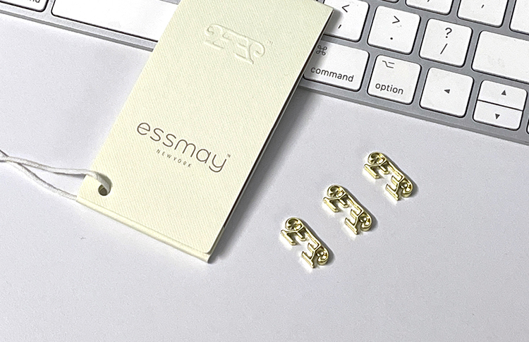
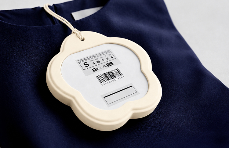
essmay hangtag that doubles as a flip book note pad + essmay icon logo garment hardware
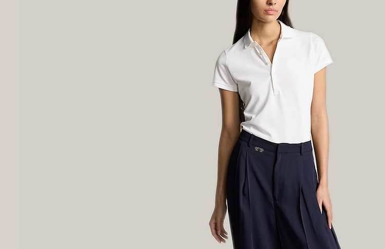
original logo icon hardware created for apparel
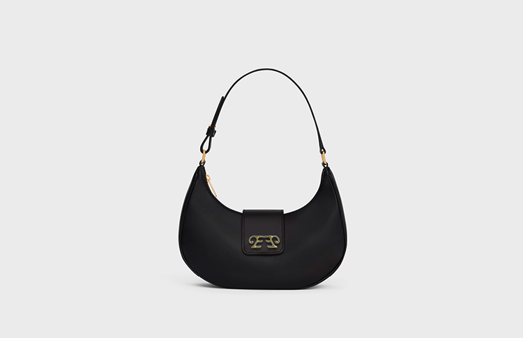
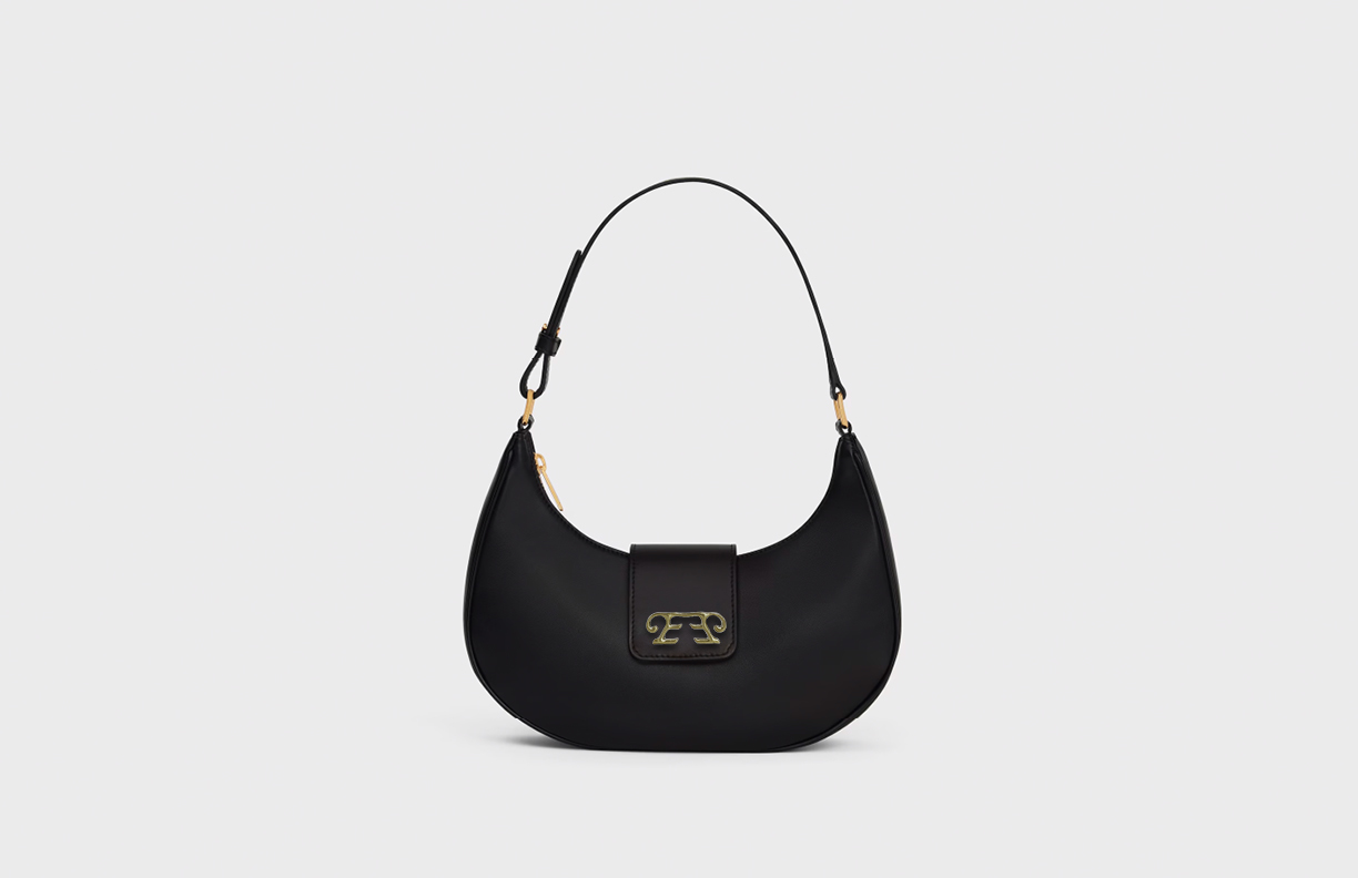
larger hardware for accessories and leather goods
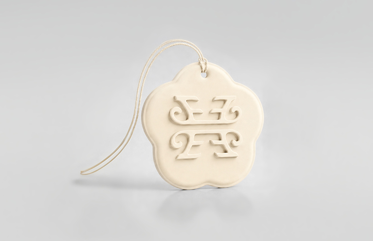
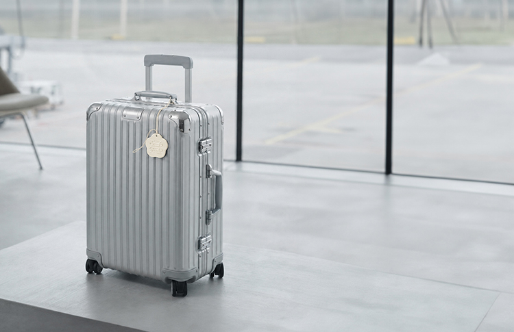
alternative hang tag that doubles as a luggage tag
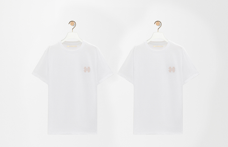
above the “logo mark” application to simple cotton t-shirts $140
below the anatomy of our logo in 3 variations
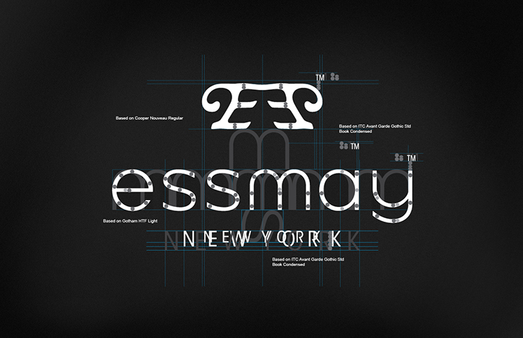
the logo was designed with version A, B, C to accommodate larger and smaller applications including knitwear and low thread count woven labels.
each project presents its own unique challenges, and no two outcomes are ever the same. much of our work is made possible by the incredible clients who trust our expertise and create the space for creativity to flourish. we are grateful and lucky to have them. to see more identity and branding click here, or you can view all work related to this project.